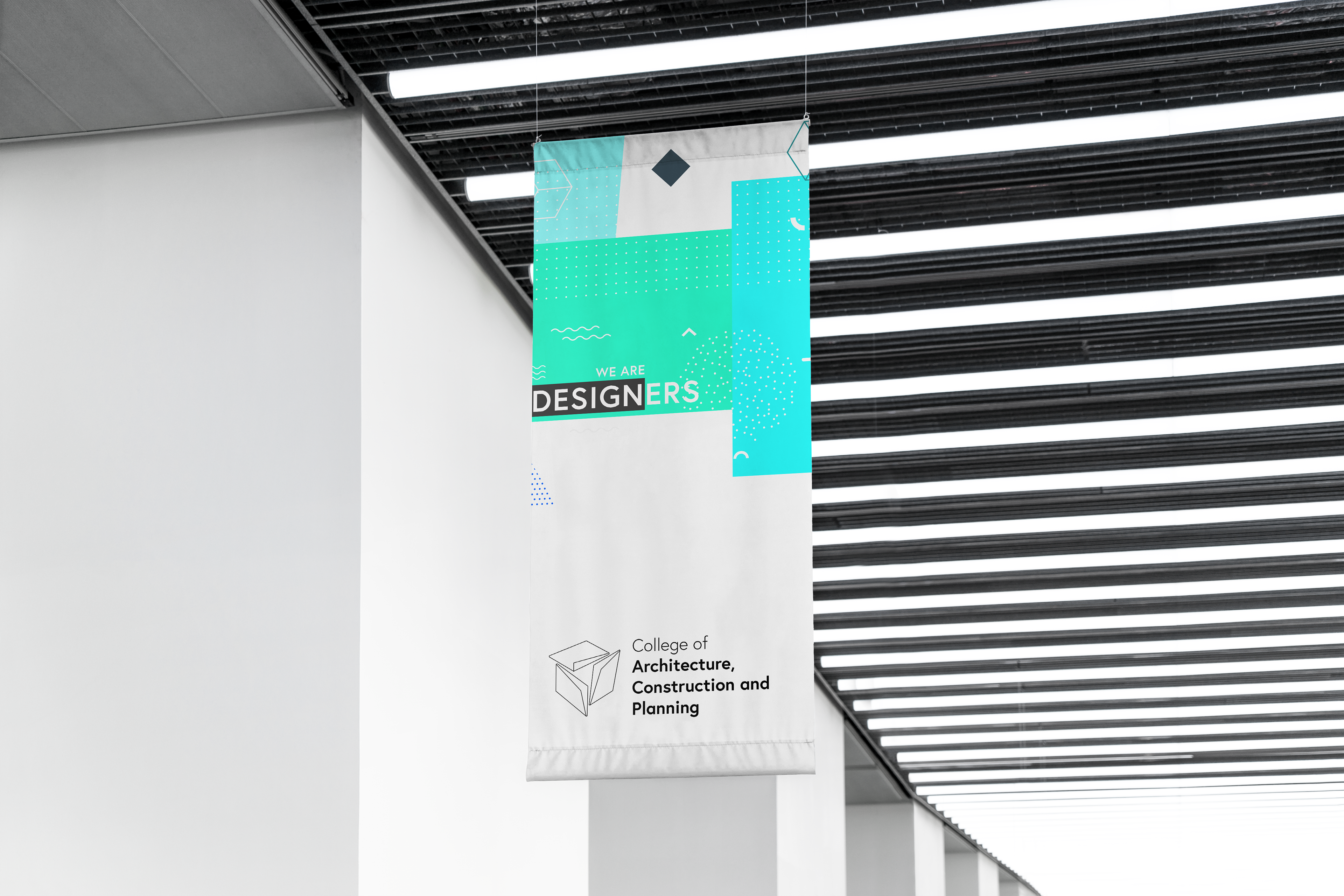
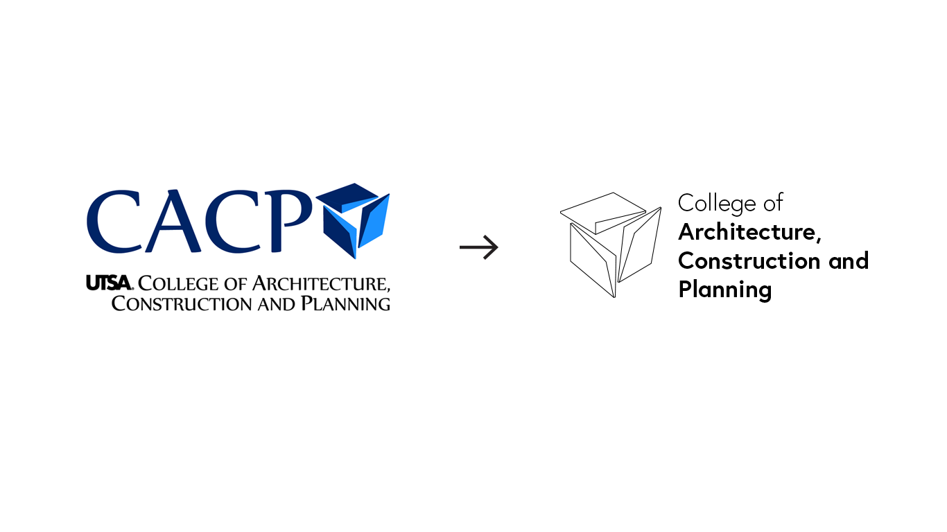
Proposal Combination Mark In order to provide a more legible and functional logotype, the combination type was preserved, but switching places from left to right to establish guidelines with the text. The new 'logotype Icon' resembles CAD techniques that students use on a daily basis, this makes the logotype more dynamic, being directly connected with the user (Architecture Students or Related). The font of the combination mark is established in two weights. One to introduce the type of institution, and the second one (strongest) to express the subject.